
Zerohedge has discovered another calendar anomaly. After the Monday effect (aka the weekend effect), we now have the Tuesday effect. That is, Tyler Durden went on a data dredging spree and discovered that S&P investors should invest on Tuesday. The S&P hit a low on November 15th and regained 268 points by May 7th, but what’s ‘mind-numbing’ is that in this obviously extremely inefficient market Tuesdays are far, far, far more profitable than other weekdays. Just have a look at Durden’s exhibit 1 (actually, it’s exhibit 2 but I’m leaving out exhibit 1 because it’s a bit unconvincing):

WOW!! Tuesday is super!! It’s sticking out like a sore thumb on the chart! You would have to be a pathological grump if you refuse to admit the significance of the Tuesday effect – or else your name is John Vos.
It seems somebody called my name, so let me respond with some grumpy comments.
Firstly, an average outperformance of 0.45% of Tuesday versus Monday (I’m comparing the two extremes) may be statistically significant, but economically it’s not. You would have to find a very cheap broker to reduce your transaction costs (don’t forget taxes) to 0.22% per trade (you need two trades: one purchase and one sale).
Secondly, the Tuesday effect is not even statistically significant, it’s just a statistical illusion (like all other calendar ‘anomalies’). There’s a lot of noise in the daily S&P data, but that noise is cleverly hidden from the chart, because all it shows is the averages for each weekday. A very useful diagram for comparing averages that does take data variability into account is the box plot:
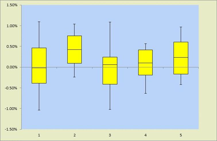
The weekdays are numbered 1 to 5; starting from Monday = 1. The average weekday returns are represented by the inner line segments in each box. They are exactly the same as in Durden’s picture, but after widening the range of the vertical axis the differences look already much less impressive. The bottoms and the tops of the yellow boxes represent the 1st and 3rd quartiles, respectively. The ends of the whiskers attached to the boxes represent the 10th and the 90th percentiles.
The high degree of horizontal overlap in the boxes shows that the ‘in-sample’ variability (height of each box, for example) is much higher than the ‘between-sample’ variability (differences in the boxes’ vertical positions). In English: the daily returns of each weekday are much more variable than the differences between weekdays. The picture is completely consistent with a pure chance result. There’s just noise, no signal.
For the die-hard skeptics (or should I say, die-hard believers?) I ran a 1-way ANOVA F-test that leaves little room for further debate. The F-test tests the null hypothesis of equal averages against the alternative hypothesis that one or more weekdays delivers superior returns.

Optimists and die-hard believers could argue that the F-statistic of 1.387 is significant at the 25% level (p= 0.243); but it’s totally, and I mean really totally insignificant at any remotely reasonable level of significance.
Let’s turn to Durden’s exhibit 2:

Hey wait a minute, the green column is three times bigger than the red one??! Doesn’t that smell a little bit odd?
Indeed, it smells like an axis with a non-zero intercept. It also smells like someone did a good job at magnifying the difference, while making sure not to do it too conspicuously (by putting the intercept at 120 for example). I guess that’s what makes cynics complain that you can prove anything with charts.
But more can be said. Let’s have a slightly more detailed look at the total point gains per weekday (Tuesday is a little bit higher in the box below than in the previous chart, I assume because Durden made the latter before close of May 7th – a Tuesday).
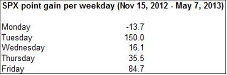
That’s 150 points for Tuesday, and only 122.7 points for all four other days taken together. However, the illusion of significance occurs for exactly the same reason as in exhibit 1, it’s only been magnified by multiplying the average by the number of weeks (total gain = average gain × number of weeks). We’ve already concluded there’s nothing remarkable about an average return of 0.40% given the high variability in daily returns (I’m now mixing up point gains and percentage returns, but there’s little harm in doing so because the S&P level hasn’t changed enormously in the last 6 months).
Now, with a small sample of data (6 months is nothing in finance), sufficiently small so as to prevent the law of large numbers to exert its powers, it doesn’t take a professional conjurer to create a spectacular illusion by gerrymandering the data, separating the high returns and lumping together the small returns. (I think it was William Poundstone who once remarked ‘I guess that’s how they draw voting districts‘).
Halloween effect, Monday effect, January effect; it seems that each time I tear off a page from my calendar the list of calendar anomalies has grown longer. No doubt tomorrow some inefficient market blogger will find another shiny new barrel containing old wine. It’s not even wine, it’s just water with a funny taste.