It often strikes me that many people, even some who should know better, hold a very naïve view of financial models, or scientific models in general. This 4-part primer will dispel many common myths surrounding mathematical models, in finance and elsewhere.
The first part explains the purpose of a model: a model is not a replica of reality; rather, the essence of a model is to simplify the real world, to break it down into “bitesize chunks”[1], allowing us to get a grip of the myriad of data we can extract from the world. Throwing away some information is an inevitable step in the process of building a model.
The second part focuses on mathematical models in finance. No, the goal of a financial model is not to predict how many points the S&P500 will be up one year from now. And no, it cannot prevent financial crises. In a few pages you will learn a lot more about what quants really do than the dozens (or perhaps by now, hundreds) of books that want to make you believe quants try to predict stock markets and financial crises.
The third part is a bit more philosophical, but at the same time the most important. It explains why a model’s assumptions are much less important than people think; why models can be very useful and interesting even though some of their assumptions are demonstrably false. Financial models are often disparaged for their unrealistic assumptions (like the assumption of hyperrational individuals), but unrealistic assumptions are used in other sciences too, including physics.
The fourth part focuses on models of human behavior. Some argue that humans cannot be reduced to numbers, and hence, that any attempt to predict human behavior is futile. This last part will demonstrate that the argument is fallacious. I will also give a number of examples of successful (albeit imperfect) models to show that such an extreme pessimism is unwarranted.
[1] http://www.emily-griffiths.postgrad.shef.ac.uk/models.pdf A very interesting 2-pager, describing various types of models and also dispelling common myths about scientific models.
Part 1: Basic example, basic concepts
Suppose you’re a contestant in a American TV game show. Hidden behind a screen is a randomly selected adult individual whose weight you have to guess. You don’t have to guess his or her weight exactly; if your guess is closer to the real weight than the other contestants’ guesses, you win. Even though you feel completely ignorant, you do know some things about human weights. To start with the most obvious, you know that weights cannot be negative. And that no human was ever observed weighing more than 600 kg. Using simple intuition you further narrow down the possibilities to a range between 30 kg and 300 kg. Are you going to pick a random value between 30 kg and 300 kg? Probably not. You also know that extremely heavy and extremely light people are less common than, call them, average people.
Because you knew the question was going to come up (the weight guess is a regular part of the show), you memorized some key statistics about the weights of American adults the day before. For instance, you know that the average adult person (m/f) weighs 74 kg. While using that as your guess, you know it’s very unlikely the person behind the screen weighs exactly 74 kg. But that’s OK, you don’t need 100% certainty. It’s the answer that’s closest to the real one that wins. One of the appealing features of averages is that they minimize your error. That is, on average (when repeating the game many times), the average tends to be closest to the real number. Written formally, your model looks like this:
W = 74 + e (model 1)
This extremely simplistic model is already much more realistic than the straw men versions that model critics sometimes attack. It explains why statisticians don’t drown in lakes that are 4 feet deep on average. It also explains why you shouldn’t feel ‘abnormal’ or ‘deviant’, if you weigh 76 kg. At the heart of the explanation lies the symbol ‘e’ in the equation. It stands for error. By explicitly inserting that symbol into the equation, you recognize that your model is not perfect. If you weigh 76 kg, the divergence of 2 kg from the average doesn’t mean you should lose 2 kg. It only says how far from the average your weight is. The error is not in people’s weights, but in the model. If you understand that basic fact (you can find it in any introductory statistics textbook), you wonder how anybody claiming expertise in statistics can be so confused as to write this (Nassim Taleb: The Black Swan, section called ‘God’s error’):
A much more worrisome aspect of the discussion is that in Quételet’s day, the name of the Gaussian distribution was […] the law of errors […]. Are you as worried as I am? Divergence from the mean (= average, JV) was treated precisely as an error! (emphasis added)
I will not go into the Gaussian distribution (also called normal or error distribution) at this point. Suffice it to say for now that the errors that Taleb misunderstands have exactly the same interpretation as they do here: the modeler’s explicit recognition that her model doesn’t fit the world perfectly. (And don’t be fooled by Taleb’s selective use of the word: the error component is just as much an essential part of his “non-scalable” distributions, as it is in any probability distribution for that matter.)

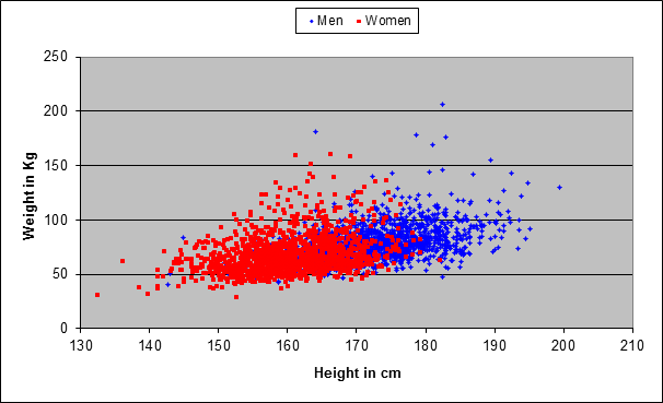
Back to our model. The figure below shows the results of a sample of 2765 Americans. Every dot represents one person (men are represented by blue dots, women by red dots). The location of the point in the diagram tells you what that person’s weight and height are. The first striking thing is that there is more blue on the right-hand side, and more red on the left-hand side, confirming the intuitive fact that men tend to be taller than women.
Now suppose the show host tells you the person behind the screen is a woman. You also know the average weights of men and women:
(Model 2)
-
W(x) = 79 + e, if x is a man
-
W(x) = 69 + e, if x is a woman
So if you guess 69 kg using the information that the person is female, that slightly improves your odds of being closest to the real value (compared with someone not using the model). Now suppose that, in addition, the host also tells you the woman’s height: 170 cm. The figure below is the same as the above, but now showing only the women:
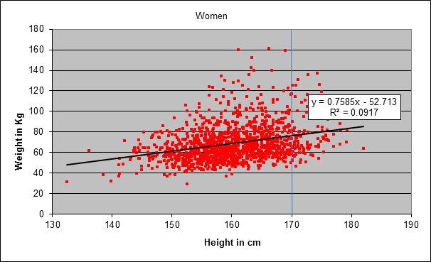
Knowing that the person behind the screen is 170 cm tall is still not sufficient to guess her weight exactly. In the sample shown in the chart, you see that there are 170 cm – women weighing only 50 kg, and women equally tall weighing as much as 125 kg (there are many points on the vertical line). A further improvement might be to take the average weight of women of that height, but if your sample size is small, you may have too few women (or even none at all) for your average to be reliable. A more sophisticated tactic is to fit a model to your data, trying to find a systematic relationship between heights and weights. The model here is a straight line that lies closest to all the data points. Mathematically it can be described as follows:
(Model 3 – only valid for females):
W(h) = (0.7585 × h) – 52.7 + e (h = height)
Note again the explicit error term in the equation. If you leave out the error term, all you have is the equation of the straight line. Even a fool can see that many points fall off the straight line. So please, don’t just swallow the accusation that economists or statisticians are yet bigger fools (especially when the critic fails to present evidence).
The way the model works is as follows: once you know the woman’s height, you plug it into the equation and work out her weight. In the example above, the height is 170 cm:
W(170) = (0.7585 × 170) – 52.7 + e = (approx.) 76 + e
Of course, you don’t know what e is in this particular case. But on average it is approximately zero (that’s one of the assumptions of the method used to fit the straight line; in reality that assumption doesn’t always hold, it almost never holds exactly, but that doesn’t necessarily make the model worthless – more on that later). In other words, the average weight of a woman 170 cm tall is 76 kg (keep in mind it’s an American woman). That’s higher than the average of 69 kg for all women regardless of height. To repeat, the point is not to come up with a precise prediction of a person’s weight given her height. The point is to use all available information to come up with an educated guess giving you an edge in a competition with someone who has no idea at all about how the two variables are related to each other.
Observe that the straight line in the chart has a positive slope: the weight increases with height. The equation of the straight line also tells you how much: the weight increases (on average!) 0.75 kg with each additional cm (approximately; the exact value is 0.7585). That doesn’t mean that a girl gains 0.75 kg for each cm as she grows (besides, the equation is only valid for full-grown adults). It means that, if you rank women by height, the group of 160 cm tall women are on average 0.75 kg heavier than the women who are 1 cm shorter. As already noted, there is a lot of dispersion around the straight line: even if you know that a women is 170 cm tall, you still have a range from 50 to 125 kg. Hence, the predictive value of the model is rather limited. The limited predictability of a person’s weight given her height does not indicate a flaw in the model. It only indicates the high variation in people’s weights, even for a fixed height. A popular measure of how well a model fits the data is the R-squared. The R-squared value for the relationship between height and weight in this example is rather low: 0.0917. It means that only 9%, roughly, of the variation in women’s weights is explained by the variation in heights.
If you’re a scientist rather a contestant in a TV show, the R-squared provides valuable information in itself (as do similar measures like standard deviation). In fact, R-squared is a key part of any realistic model, giving an indication about its predictive power. In financial data, you will typically find low R-squared values, indicating a high degree of uncertainty in predictions. At risk of overrepeating myself, that’s not a flaw in the model; it’s just a fact of reality. Perhaps you’ve heard the joke defining a good economist as one whose predictions are just as bad as the bad economist’s, except that he can explain you why his predictions are so bad. The joke is true. But rather than pointing out an amusing deficiency typical of economists, it merely points out that reality is not completely predictable (which is not the same as saying that reality is completely unpredictable – that would define a lazy economist…).
Summary of part 1: The point of a model is not to represent reality up to its minute details. Reality is much too complex for that. The point is to simplify reality, to grasp some of its most salient aspects while ignoring less important ones. A model doesn’t have to be 100% accurate to be useful. Even a weak model can give you an edge relative to someone who has no model at all. A modeler always knows that her model is imperfect. That’s why she uses metrics indicating the degree of uncertainty implied by her models, like standard deviation, R-squared, or confidence intervals (see next part).
Thank you for this – it is an interesting start, and I look forward to reading the next parts. I do have a suggestion for one small correction, though. In introducing the first chart, you write that: “The first striking thing is that there is more blue on the right-hand side, and more red on the left-hand side, confirming the intuitive fact that men tend to be heavier than women.”
The X-axis is height, so more blue dots on the right indicates that men are (generally) taller than women, not heavier. There are also more red dots higher on the chart (on the Y-axis), although it is more difficult to see (higher variability in height than weight, or perhaps it is an effect of the scales on the chart). I would suggest a re-write along the lines of:
“The first striking thing is that there is more blue on the right-hand side, and more red on the left-hand side, confirming the intuitive fact that men tend to be taller than women. The blue dots also appear higher on the chart than the red dots, confirming the equally common observation that men tend to be heavier than women, as well.”
Cheers,
Dean
You’re totally right. It’s crazy that I didn’t spot this before. I made the correction and replaced ‘heavier’ by ‘taller’. The difference in weights is difficult to see, as you say, so I just omitted that. Thanks for pointing this out!